
Backlit Designer Wall Clock | Lumio
A backlit wooden wall clock that changes what you put on a wall
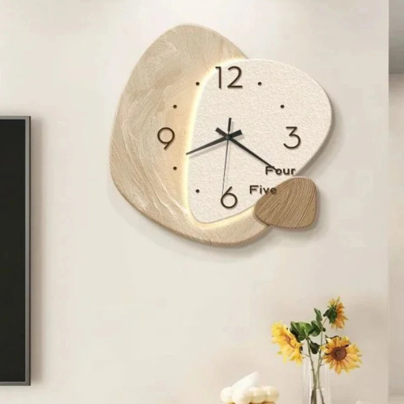
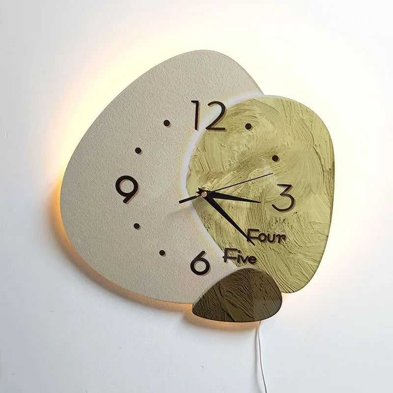
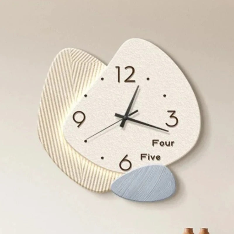
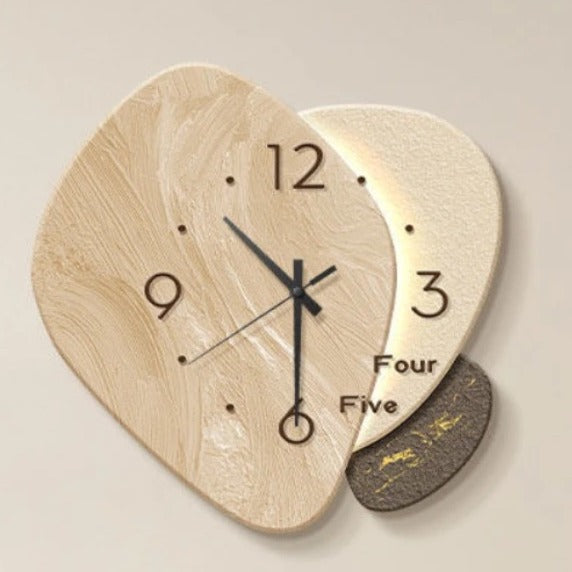
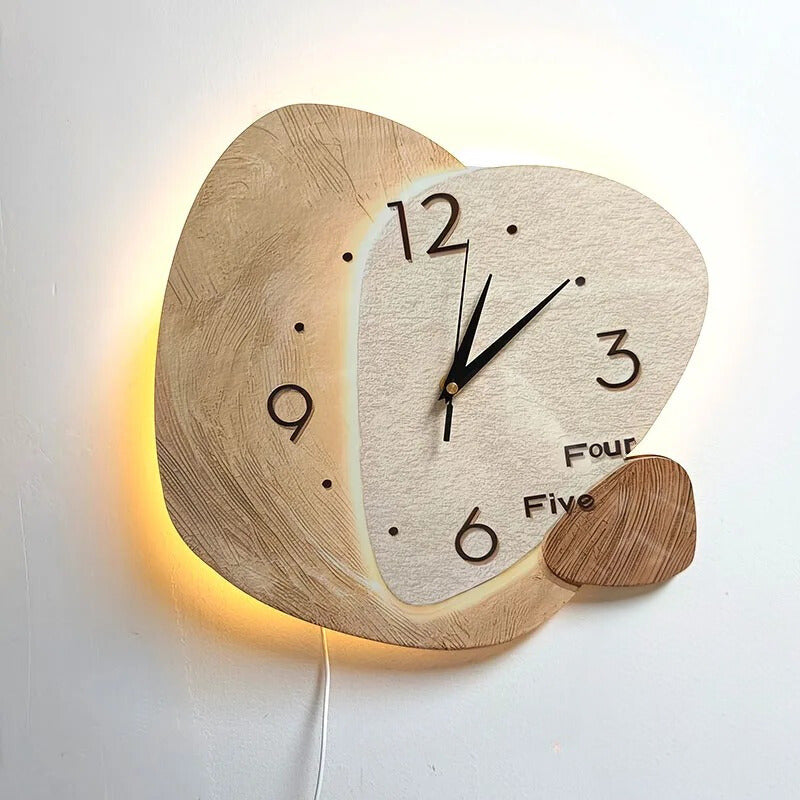
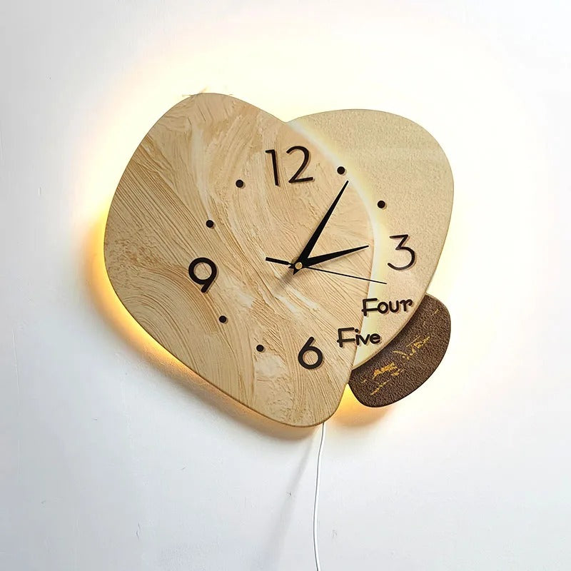
What catches the eye first is the shape. Two overlapping discs, slightly offset from one another, creating an unexpected sense of depth on the wall. The back disc, with its organic, irregular outline, brings to mind the shape of a flattened pebble. The one in front, lighter in tone, carries the face. Between the two, a warm glow slips into the gap and traces the edge of the face with an amber light that warms the whole composition.
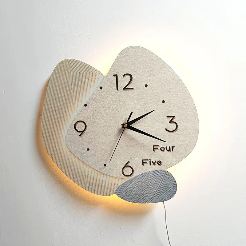
The wood grain of the background isn't a flat printed pattern. The veins run diagonally, subtly contrasted, with the characteristic grain of dry-treated light wood. Under the raking light diffused by the LEDs, this relief becomes even easier to read, and the piece stops looking like a clock and starts looking like a sculpture set against the wall.
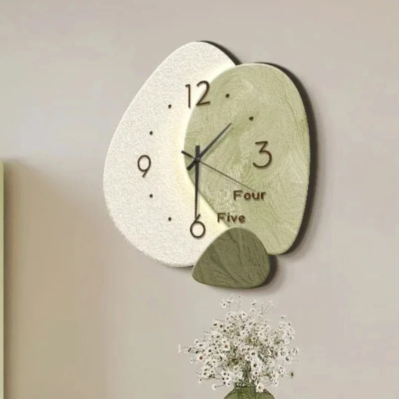
The face itself is understated: a few Arabic numerals at key positions, dots for markers, slim hands with a flat profile. What's spelled out in full, "Four" and "Five" in place of the 4 and 5, is a typographic detail that stands apart from the rest and gives this backlit wooden designer wall clock a clearly contemporary character. A small piece of grained wood is fixed to the outside of the face, slightly set back, like a decorative counterweight that visually anchors the whole design.
The version without LEDs works as a classic decorative wooden wall clock. The LED version turns the piece into a glowing focal point, particularly effective in a dimly lit hallway, behind a television, or in a living room with soft evening lighting. The choice between 30 and 40 cm determines its impact: at 30 cm, the piece blends in discreetly; at 40 cm, it commands the wall.
If you're after bolder sizes, our Large Wall Clocks collection offers pieces that take up more space. To explore other models with this same balance of natural material and contemporary line, our Modern Wall Clocks collection brings together the closest references to this style.
Four styles, one shared approach
The four variants of this clock aren't simply different colourways. Each style varies the balance of the two discs, the wood tones used for the background, and the position of the small grained-wood element attached at the edge of the face. Some styles heighten the contrast between the light background and the face, others lean into a more uniform palette where the two planes almost merge.
What stays constant across every style is the principle of layered relief: the piece casts a shadow on the wall even without the LEDs switched on. This visible depth, seen from an angle, is what sets this model apart from a clock hung flat against the wall. The wall stops being just a backdrop and becomes part of the effect itself.
Choosing the right style depends mainly on the wall it will hang on. On a white or beige partition, the light-wood-background versions blend in naturally. On a more textured or slightly tinted surface, the higher-contrast variants hold their own better. Pairing either with the LEDs remains worthwhile in both cases, as long as the room has ambient rather than strong direct lighting.
Choose options