
Organic-Shaped Wall Clock with Roman Numerals | Dalvo
A shape that bends time
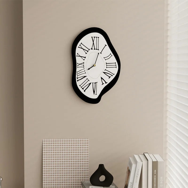
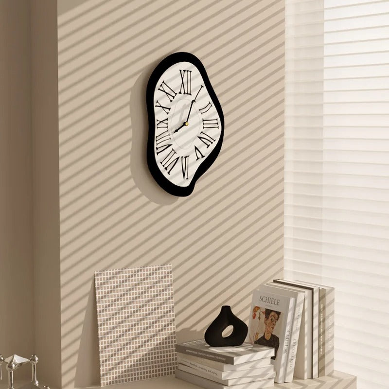
That irregular outline, which ripples without ever settling into a predictable curve, is the first thing you notice. A thick black frame encloses a slightly domed white dial, and the tension between the dark edge and the pale surface gives the whole piece a sense of volume that round or square clocks simply don't produce. On a beige or light grey wall, the contrast is clear without being harsh.
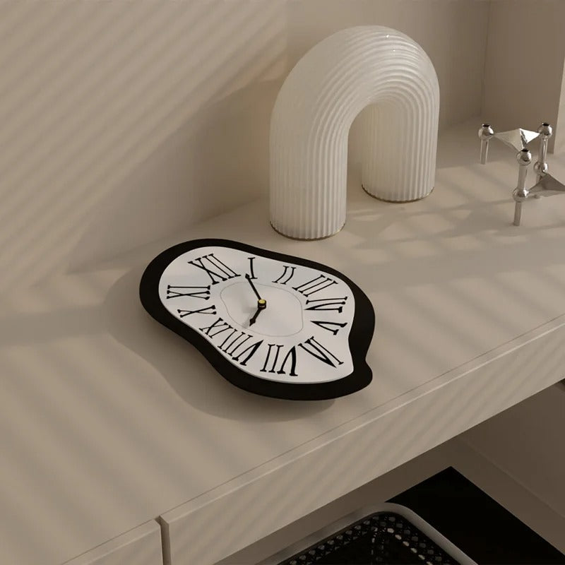
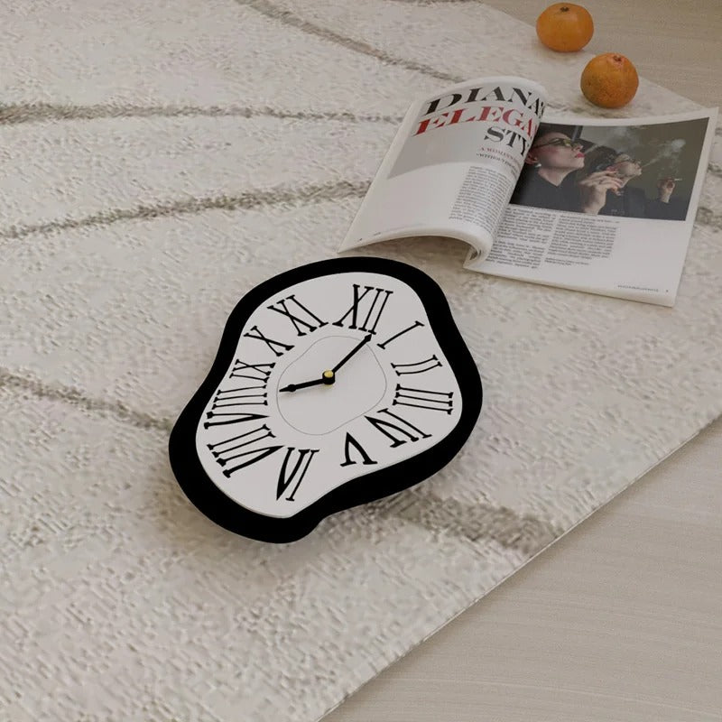
This organic-shaped wall clock with Roman numerals plays on a deliberate visual contradiction: Roman numerals set in a classic typeface, placed on an outline that is anything but classic. The XII, IX and VI don't sit where you'd expect, because the dial doesn't resemble any circle. Each numeral follows the curve of the edge, slightly tilted, slightly offset. That offset is exactly what gives the dial its character.
The hands are slim and elongated, with a gold centre that contrasts subtly with the dominant black. Against the white dial, their outline reads clearly. Both the hour and minute hands have a flat profile, which stops them disappearing visually at certain lighting angles.
In the 34x20cm version, this organically shaped clock suits a hallway wall, a wide shelf, or a tighter space where you want an object that makes an impression without cluttering. At 40x26cm, it takes up more visual space and can stand alone on a living room or hallway wall.
This model fits interiors that mix soft-lined furniture with more structured elements. On a bare wall with a few objects placed below — as shown here with a small vase and some books — the result feels balanced without looking overly staged.
If you're after other unconventional shapes, our Modern Wall Clocks selection brings together models that break from the usual mould. For larger formats that really dress a wall, take a look at our Large Wall Clocks collection.
What the Roman numerals change here
On an ordinary round clock, Roman numerals are a fairly predictable classic. Here, they work differently. Because the organic outline redistributes each numeral across an asymmetric surface, the Roman numerals lose their usual, predictable decorative role. They adapt to the shape rather than structuring it, and that's exactly what makes them interesting on this dial.
The typeface chosen is understated, with fine serifs and generously sized numerals. The XII at the top of the dial is especially legible despite the distorted outline. The I, II and III follow the curve of the right-hand edge with irregular spacing that, paradoxically, looks entirely natural to the eye.
This typographic choice grounds the piece in something recognisable. Without the Roman numerals, this organic clock could tip into pure abstraction and lose its legibility. With them, it remains unmistakably a clock — but one whose silhouette stays with you once you've seen it.
It's the kind of object that doesn't resemble anything else in a room, and doesn't need any explanation to be noticed.
Choose options