
Blue organic-shape wall clock | Bloba
A blue organic-shape wall clock that changes what a wall can be
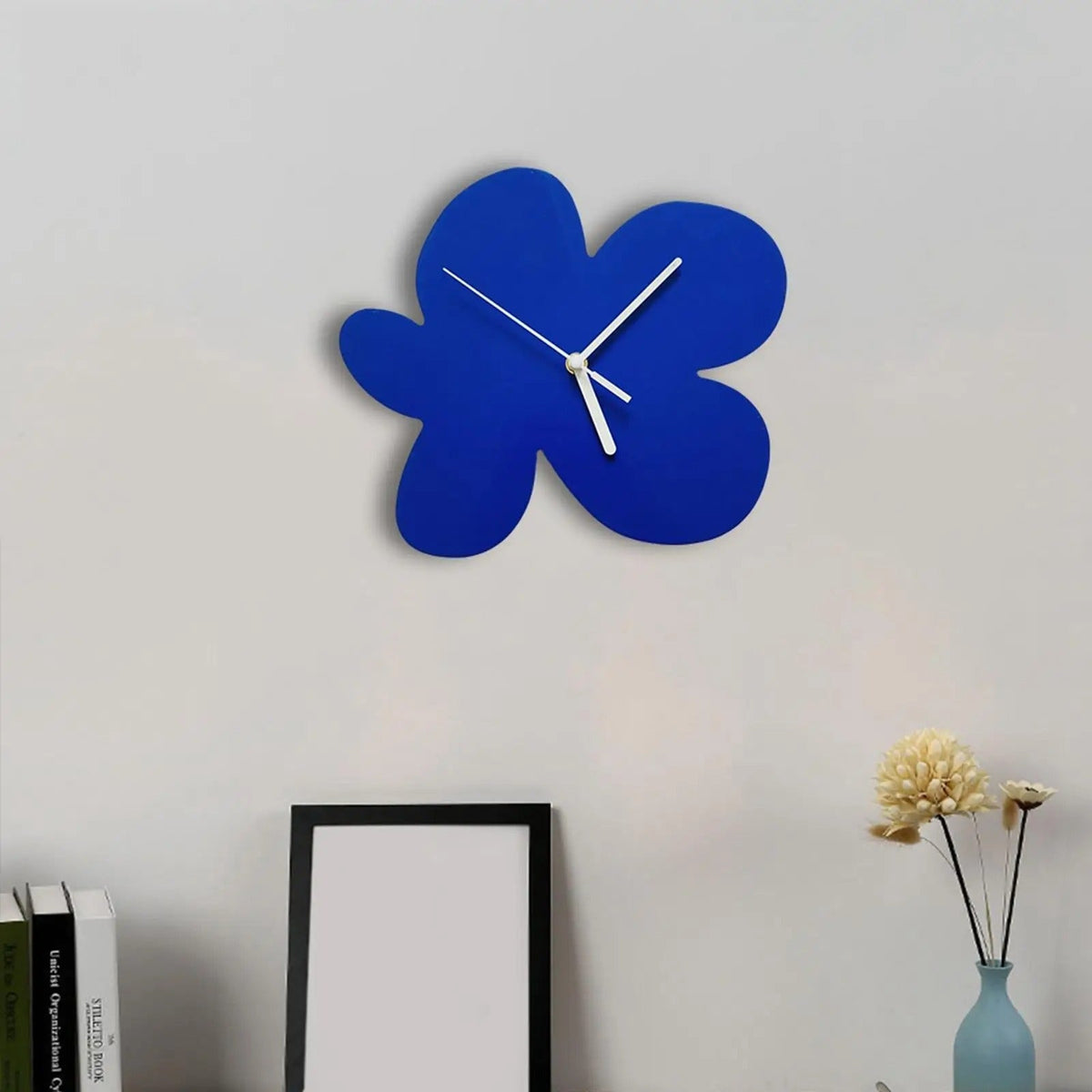
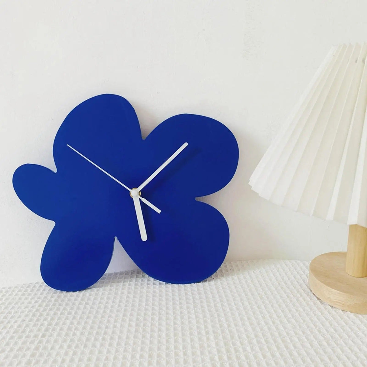
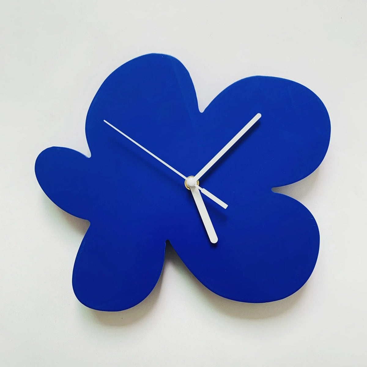
This blue stops you in your tracks. Not navy, not sky blue. A bold, dense, almost electric blue that holds its tone evenly across the whole surface, with no variation and no glare. The material absorbs light rather than reflecting it, giving the piece a solid, matte presence on the wall.
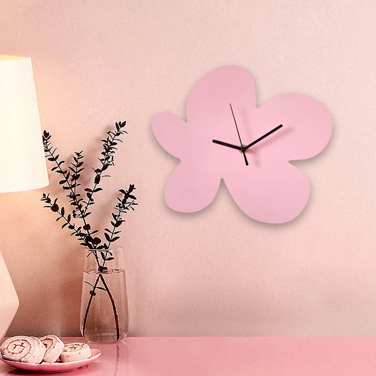
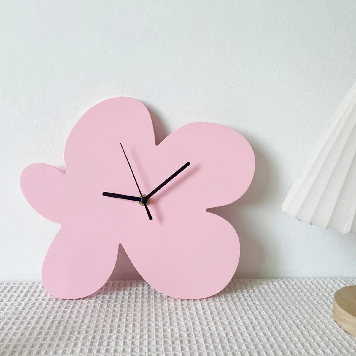
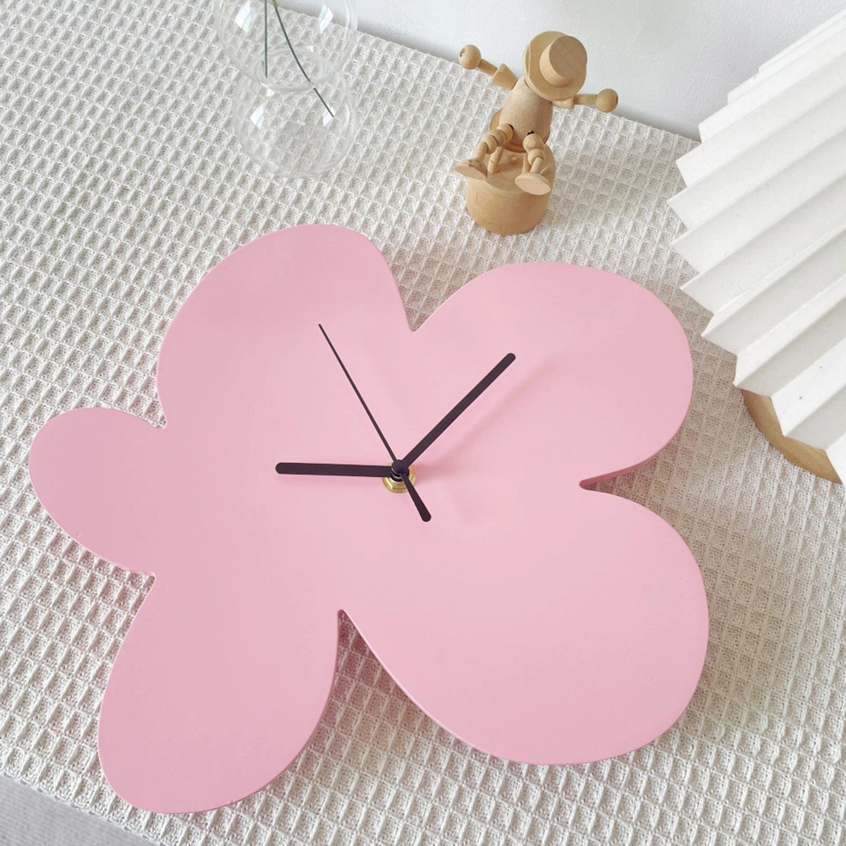
The silhouette is what really sets this blue organic-shape wall clock apart from anything else typically found in this category. Four rounded lobes meet in a soft, flowing outline, somewhere between a stylised flower and an abstract form you can't quite put a name to. That ambiguity is exactly what makes it work: the eye keeps returning to it, searching, and eventually accepts the shape for what it is — an object in its own right, not just a dial set into a standard case.
The white hands stand out sharply against the coloured background. Their slim, elongated profile sits well at the centre without cluttering the read. Telling the time takes no effort at all, which isn't always the case with boldly designed clocks. Here, the absence of markers and numerals is no obstacle: the shape of the dial itself is clear enough to orient yourself without numerical cues.
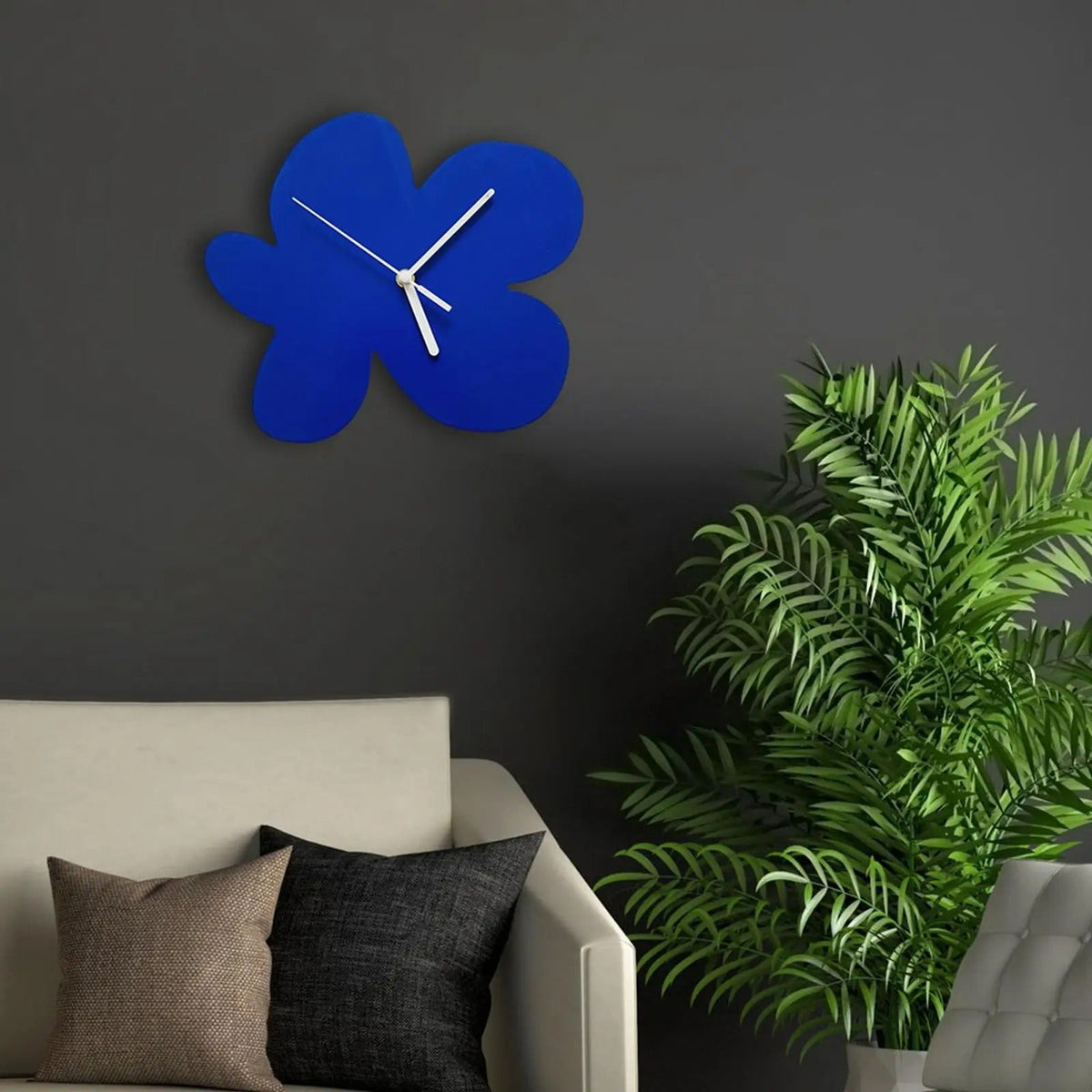
On a light wall, this clock stands out as a striking graphic piece. On a coloured wall in matching or complementary tones, it settles in differently, more in dialogue than in contrast. The pink version, also available, works on the same principle but in a warmer register, closer to interiors built around terracotta or linen tones. The blue, meanwhile, suits spaces where colour is used with intent: a study, a hallway, a bedroom built around a considered palette.
This organically-shaped design fits naturally into a search for Modern Wall Clocks that step outside conventional formats. For those exploring larger formats with the same graphic spirit, our Large Wall Clocks collection offers other high-impact silhouettes.
Colour as the starting point
Most wall clocks start from their format or material. This one starts from colour. The blue chosen here isn't a supporting shade slipped into an interior to round off a scheme. It's a colour that takes up space and makes a statement. You hang it because you want that particular blue on that particular wall, and the clock comes with it.
It's an approach that calls for a degree of conviction in your decorating choices. The uniform matte surface of this design won't forgive a poorly chosen wall, but it richly rewards a wall considered with it in mind. In a space where everything else stays neutral, it becomes the sole point of colour, and that's enough. In an interior already built around a palette, it settles in as if it had always been there.
The organic shape reinforces this effect further. A round or square clock draws less attention precisely because it matches expectations. This four-lobed outline, on the other hand, creates a small moment of surprise for anyone entering the room. Not a dramatic effect. Just that slight shift that makes you notice an object instead of glancing straight past it.
Choose options